Put a candidate in your desktop!
Download the pictures (640*480) and watch the 2 videos of the candidate major of Skopje 🙂
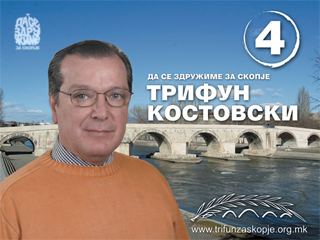
Review: the logo is very well made, it focuses on the old bridge as the best known symbol of the city and to an olive branch as a symbol of peace. The olive branch becomes the bridge itself in the logo, meaning that the only way to recover the identity of the city is through peace.
Moreoever, the olive branch become this way a tool to connect. As the Skopje bridge is linking the two sides of the city, the olive branch, that is peace, is the only way to link ethnic communities. The logo, then, melts, strenghtening them eachother, two important values, identity and peace, which can easily be turn into recognizable political issues. I guess it’s doing its work.
I can’t say the say about the “corporate” image as it is declined in the site and in the pics. You can see that the photomontage of the poster is made with poor ability, simply superimposing a potrait with the bridge scenario, just achieveing, this way, the result of looking funny (this is why it actually is on burekeaters).
Ciao Trifun and good luck for the second part of your electoral campaign!
1 Comment
Jump to comment form | comments rss [?] | trackback uri [?]